
Interior Design Mistakes to Avoid in 2026

Most decorating mistakes aren't dramatic. No one paints a wall neon green and calls it a day. The mistakes that actually hold a room back are quieter than that: furniture scaled slightly wrong, lighting that flattens everything, rooms that look considered in isolation but don't connect as a home.
Some of these have always been common. Others have crept in over the last few years as certain trends became defaults. Here's what to watch for in 2026.
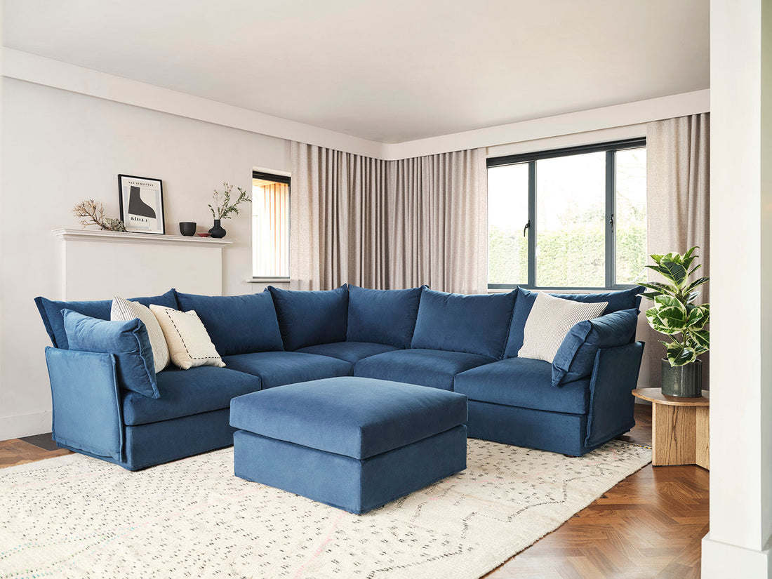
Choosing furniture that's too small for the space
This is the most consistent mistake across homes of every size. A sofa that's too small makes a room look undercommitted. A rug that doesn't reach far enough makes the seating feel unanchored. A coffee table that's disproportionate to the sofa makes the whole arrangement look like it was assembled in stages rather than planned.
The instinct to "not overdo it" in a room, to keep things light, to not crowd the space, often tips over into undersizing. But a room needs weight. Furniture that's the right size for a space gives it confidence.
The rule that holds up well: the front two feet of every sofa in a seating arrangement should sit on the rug. If the rug isn't large enough for that, the rug is too small. For sofas, measure the full footprint on the floor before ordering. Laying out the dimensions with tape is a much more useful check than looking at numbers on a spec sheet.

Relying on a single overhead light
This one dates a room more than almost any other mistake. A single ceiling light, on all evening at full brightness, creates flat, harsh light that removes all depth from a room. It makes everything look the same distance away, flattens texture, and makes a sofa or a piece of art look worse than it actually is.
Good lighting in a living room is layered: overhead light for ambient fill, table or floor lamps for warmth at lower levels, and task lighting where you need it. The overhead doesn't have to disappear. It just needs company.
The fix is straightforward: add two or three floor or table lamps and use them instead of the overhead light in the evenings. It costs relatively little and changes how a room reads more than most furniture changes would.

Pushing all the furniture against the walls
This is particularly common in smaller rooms, where the instinct is to maximise the floor space in the middle. The result is usually a room that feels like a waiting area: seating arranged around the perimeter, a gap in the middle, no sense of a centre.
Furniture that floats slightly from the wall, even by 20 or 30cm, makes a room feel more deliberate and easier to be in. Grouping pieces closer together creates a seating area that feels enclosed in a good way, rather than spread thin around the edges.
In open-plan spaces, pulling furniture away from walls is how you define zones. A sofa with its back to a kitchen or dining area signals a boundary without a wall, which is often all an open-plan space needs to feel properly composed.

Matching everything too closely
Matched sets — sofa, armchair, and footstool in identical fabric; bedside tables and wardrobe from the same collection — feel resolved in a showroom. At home, they read as flat. Everything has the same weight and the same era, which makes a space feel less lived-in and less personal.
The better approach is cohesion rather than matching. A consistent colour palette, a shared material thread (wood tones that complement each other, fabrics in the same register), pieces from different sources that feel like they belong together rather than pieces that were bought together. Contrast within a shared palette is what gives a room visual interest.
This applies to sofas and chairs particularly: a sofa and accent chair in the same fabric but different colours, or different fabrics in a shared colour family, tends to look more considered than an exact match.

Ignoring the fifth wall
The ceiling. It gets painted white as a default in most homes and then forgotten. The problem isn't white. White ceilings work perfectly well in many spaces. The problem is when the ceiling is white by default rather than by design. A room that has had real attention paid to the ceiling reads differently to one that hasn't.
Options that don't involve drama: painting the ceiling the same colour as the walls for a cocooned, enveloping feel; extending a deep wall colour onto the ceiling for added depth; adding a simple cornice or coving to give a room more presence. None of these are major projects, and all of them change how a room feels to be in.
Getting the sofa wrong for the room
The sofa is the largest piece of furniture in most living rooms, and the one most likely to cause a problem if it's wrong. Common issues: a sofa with arms that are too high for the proportions of the room, a sofa that faces a wall rather than the window or a natural focal point, a sofa with a fixed configuration placed in a room that would have worked better with a modular one.
On the last point: fixed sofas suit rooms with a settled, defined layout. Modular sofas, built from individual sections that can be reconfigured, suit rooms that serve more than one purpose, or homes where the arrangement is likely to change. If the room doubles as a workspace, a guest room, or an entertaining space, a modular sofa gives you flexibility a fixed piece can't.
For help choosing between the two, our modular vs corner sofa guide and Model 03 vs Model 06 comparison cover the main decision points.
Over-accessorising to fill space
A room that feels empty is often dressed rather than furnished: accessories added to compensate for furniture that isn't quite right, or to fill visual space that would actually benefit from being left alone. The result is rooms with many small objects that don't collectively add up to anything.
The cleaner approach: fewer pieces with more presence. One large piece of wall art instead of a gallery of smaller prints that dilute each other. One well-chosen vase rather than a shelf of smaller objects at the same height. Negative space, whether wall, floor or surface, isn't a problem to solve.
This is also where the trend towards maximalism in recent years has caused difficulty. Layered texture and collected objects can work well, but it requires a clear editorial eye. Without that, the result tends to be accumulation rather than curation.

Not testing paint colours before committing
Paint colour is the most reversible thing in a room and also the most commonly got wrong. The mistakes are consistent: choosing from a paint chip in a shop rather than in the room itself, testing on a small square rather than a full section of wall, and not checking the colour at different times of day.
Paint colours read entirely differently in different light. A warm white that looks perfect in a south-facing room can look yellow in a north-facing one. A grey that looks clean in the morning can look cool and blue in the evening. A sage green that works in natural daylight can read dull under artificial light.
Test on a full A3-sized section of wall at a minimum. Check it in morning light, afternoon light, and at night with your actual room lighting. Only then does the colour tell you what it actually is in your home.
Treating rooms as separate problems
The most common version of this: a living room, hallway, and dining area in different colours, different styles, different references, no thread between them. Each room might be fine on its own. Together, they feel disjointed.
Homes that feel coherent tend to have one or two material threads running through them: a consistent wood tone, a colour that appears in different registers across rooms, a shared fabric vocabulary. This doesn't mean every room looks the same. It means there's a logic to the choices that makes the whole thing feel like a considered home rather than a series of individually decorated rooms.
A mood board, even a rough one, before starting any significant work helps enormously with this. Seeing everything together on a flat surface makes it much easier to spot where things conflict. See our guide on how to create a physical mood board for a practical approach.


