
8 Colours to Combine With On-Trend Serene Blue
8 Colours to Combine With On-Trend Serene Blue
If you’re looking to update your home with an on-trend colour in 2025, serene blue could be for you. Serene hues are gentle, muted colours like powdery lilacs, soothing greens, and soft blues. They’re a great way to bring some subtle colour to create a tranquil space, adding more visual interest than neutrals alone without the intensity of a bold palette.
A soft blue shade is ideal in any room where you want to feel calm and is particularly well-suited to the bedroom to transform it into the perfect place to unwind after a long day.
Whether your decor style leans more maximalist with statement upholstery or you prefer pared-back, warm minimalism, serene blue can be styled in numerous ways. This might mean a full redecoration if you want an overhaul, or you can easily refresh your space with accessories, such as a rug, throw, or cushions.
This misty blue tone pairs well with a variety of colours to elevate your space. We’ve highlighted eight combinations we love – depending on the mood and aesthetic you’re after.

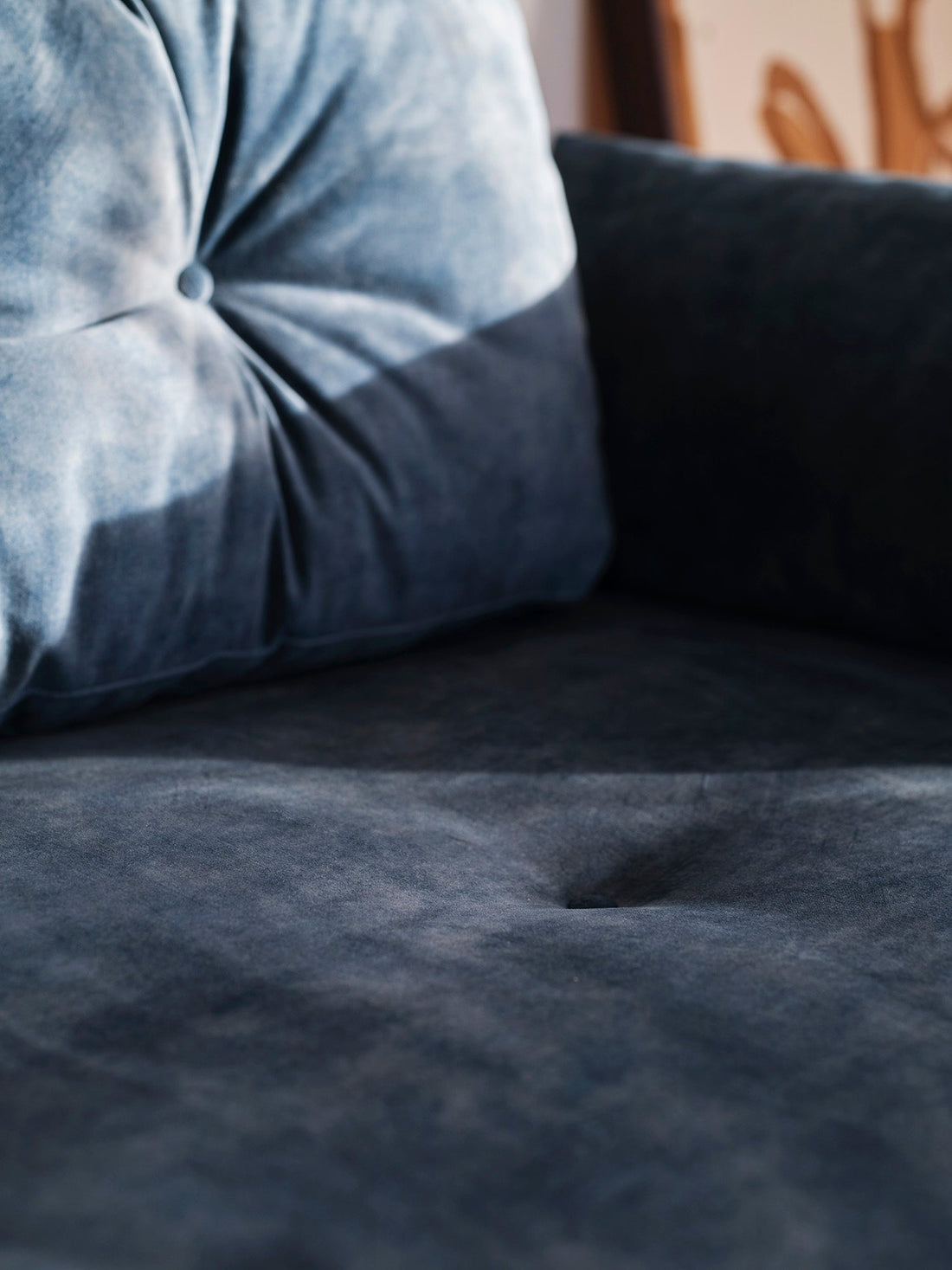
The blues
Turn a room into a sanctuary by layering different tones of blue in the same room to create depth and harmony. Combine a powdery blue on the walls with dusky blue bedding or a velvet upholstered bedframe in teal or indigo. For even more impact, colour drench the room by painting your walls, trim, and ceiling in the same blue tone. You can take it one step further by adding a blue sofa or armchair for a striking yet peaceful look.

Muted greens
Thankfully, the old myth ‘blue and green should never be seen’ is well and truly in the past. Whether you go for a light sage or a deeper earthy tone, green and muted blue create a restful, nature-inspired look that taps into the Biophilic design trend. Think blue-painted wardrobes against green walls, wallpaper with a botanical print combining the two colours, or a blue ceramic vase with large, leafy stems.

Warm neutrals: sand, oatmeal & taupe
Warm, earthy neutrals balance the serene blue’s coolness beautifully. These sun-kissed hues move away from sterile, minimalist rooms and create a comfortable, homely feel. Try Swyft’s Horizon Clay Rug, which mixes lighter and darker clay and warm beige tones, or go for furnishings in shades like sand, oatmeal, and taupe. This palette gives a room a grounded look and works well with natural textures like jute, linen, cotton, and warm wood tones.

Dusty pink
Dusty and clay-toned pinks create an elegant contrast to pale blue that brings added warmth. Introduce the colour through soft furnishings like a blue velvet sofa against clay-coloured walls, cushions for a touch of pink, pink-toned artwork in a blue room, or choose a pink flowering plant or bouquet for a simple, low-commitment option.

Terracotta
Terracotta is another warm, earthy shade that creates a welcoming, laid-back look alongside misty blue tones. There are many ways to use this combination – from terracotta tiles to pottery or a tablecloth and glassware to complement a serene blue vase or painted walls.

Deep burgundy
An update on last year’s ‘unexpected red’ theory, which focused on primary reds, is to pair light blue with deep burgundy or wine tones for a sense of drama. This elegant mix can be easiest to do by selecting small pops of burgundy with decor like candle holders, side table lamps, and small pieces of furniture like a storage ottoman.

Light yellow or mustard
Bright, primary yellow can be intense with blue, especially in large amounts, so pair serene blue with mustard or buttery yellow accents for a softer approach. These colours complement each other and create an uplifting look without being overstated. Try light yellow or mustard-coloured ceramics, an occasional chair, or place a bowl of lemons on your dining table or sideboard for a summery touch.

Orange
Citrus pops are big this season, so why not embrace the opposite side of the colour wheel and combine powdery blue with orange? Bring small bursts of orange with decor, such as a sofa throw or a patterned cushion. The shade doesn’t necessarily have to be in your face – a pale peachy orange balances misty blue well for a cheerful but calming feel.
If you want more inspiration on refreshing your home this season, take a look at our blogs on 2025 spring/summer interior trends and spring colour palettes.


