3 Interior Design Colour Trends for 2025

Colour plays a huge part in defining the mood of a room—and this year, we’re predicting a shift towards subtle, sophisticated palettes that break away from the neutral norms.
1. The NEW Pop of Red
The “pop of red” trend, which adds an instant lift to any room, first gained popularity on TikTok. As we move into 2025, this trend will evolve into a more subtle, timeless approach that endures—becoming less about bold statements and more about refined, lasting accents.
Which tones to use for the new pop of red trend
Rather than the intense primary reds we’ve seen in 2024, 2025 is about warm cherry reds and burgundies—tones that feel a bit more approachable.
How to apply the new pop of red trend to a room
Because these tones aren’t as bright as 2024’s trending reds, they can lend themselves to larger surfaces, without feeling overbearing. Add a pop of red with curtains, rugs, sofas and chairs—or paint the ceiling to make a real statement.
2. Dark and Earthy
Dark, earthy hues bring a cosy, inviting warmth to spaces—something we’re all striving for in our homes. Previously people have thought they needed certain spaces to use darker colours, but 2025 will be the year we realise how easy they are to incorporate into our homes.
Which tones to use for the dark and earthy trend
Going into 2025, we’ll see deep murky greens and warm browns—colours that take inspiration from nature beyond leafy, grassy greens. This trend is way more moody and dramatic.
How to apply the dark and earthy trend to a room
The key to using this colour palette effectively is to mix various tones while staying within a warm palette. Layering different textures is also essential—for instance, try matte chocolate paint on the walls, a raw wood coffee table and a brown sofa.

3. Serene Hues
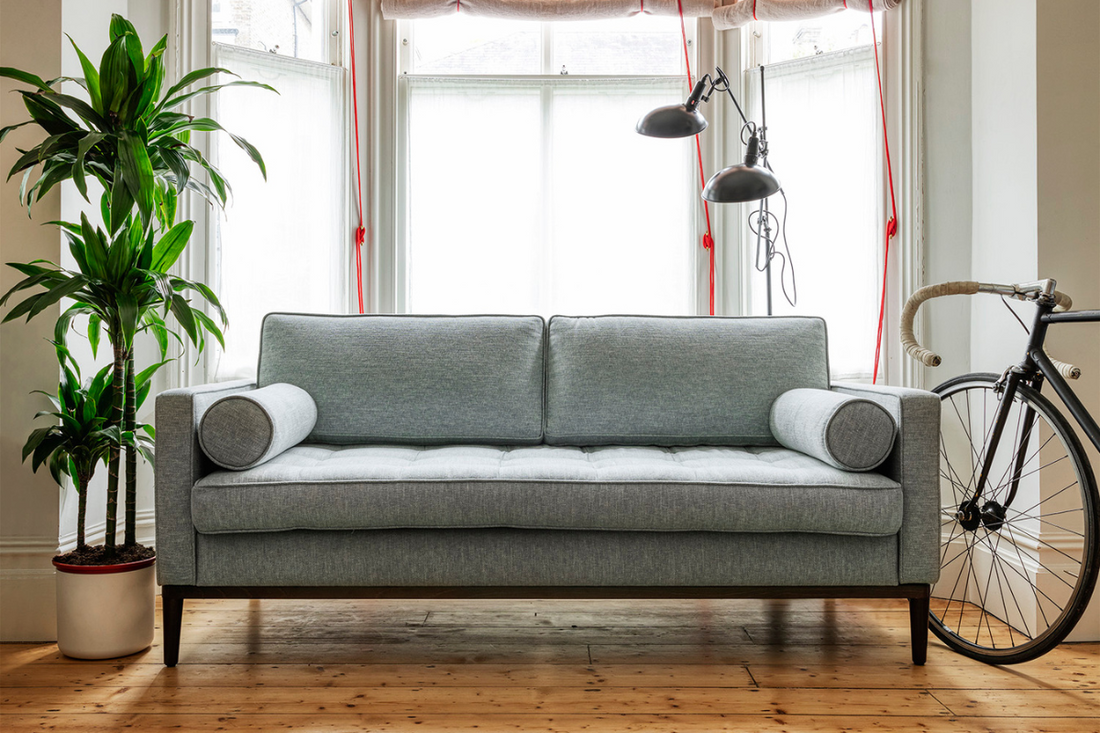
In 2024, Pinterest predicted that ‘Serene Hues’ would shape our end-of-year decor. It’s a trend we see continuing into 2025. These gentle, softer shades reflect a desire for tranquillity and balance in our living spaces—a perfect antidote to the stresses of daily life.
Which tones to use for the serene hues trend
This trend moves away from go-to neutral palettes and instead, leans into muted versions of bolder colours. Go for calm greens, soft blues and powdery lilacs to bring a relaxing feel to any room.
How to apply the serene hues trend to a room
Much like the dark and earthy trend, these colours work extremely well when you layer different tones of the same colour within a single space. For example: pair a soft green wall in the bedroom with a darker green throw on the bed.
Ultimately, the colours you use in a room depend entirely on the space you have and the mood you wish to create. But if there’s one theme that runs through all of these trends, it’s this: don’t be afraid to play with colour in your home. Whether you paint the walls, or decorate with tonal accessories, you can choose to go all-in on a shade, or add subtle additions that you can interchange at any time.
Over the past decade, we’ve seen interior design swing from one extreme to the other: from all-neutral spaces, to bright, bold and colourful. 2025’s more subtle tones sit somewhere in between.
Want more interior design predictions? Read our report on the biggest trends we’ll see in 2025.
Share
Tags
- 2025 Interiors
- colour palettes
- trends


