
How to use Dulux’s Colour of the Year 2024 Sweet Embrace
How to use Dulux’s Colour of the Year 2024 Sweet Embrace
We’re calling it now: Barbiecore is dead – or at least on its way out. We knew it was going to happen – and with Sweet Embrace being Dulux’s Colour of the Year 2024, Barbiecore or Hot Pink will be snowballed into a list of dead and buried trends – finally.
But, if you insist on incorporating pink into your home, how can you do it and make the colour last? Big question. That’s why, we spoke to our interior designer, Kelly Collins, to see how a pink and sweet embrace can be paired as a way to tone down a pink home.
Kelly breaks down adding pink into your home with these 3 steps:
- Choose a classic colour
- Add soft furnishings
- Add a lick of paint
She then makes suggestions on how to use pink in rooms around the home and interior features:
- Can you add pink to the kitchen?
- Can you introduce pink to the bedrooms?
- Does pink go with architectural features?
So without further ado, here’s Kelly’s thoughts on how to add pink into your home whilst baring in mind that hot pink and Barbiecore is a trend on its way out.
Choose a classic colour
First things first: remember the 60, 30, 10 rule.
60% of the room should be a dominant colour. This could be the colour of your walls, for example, because that has the most coverage of colour. 30% of the room should be a secondary colour, a texture or a pattern. And then 10% should be an accent colour.
So, when it comes to styling the room with pink, the walls could be a soft white with an ever-so-slight pink shade like Sweet Embrace. The 30% could be a baby pink and, although it pains me to say, the accent colour could be a hot pink. Generally speaking, don’t use the same tone of pink or texture throughout the room.
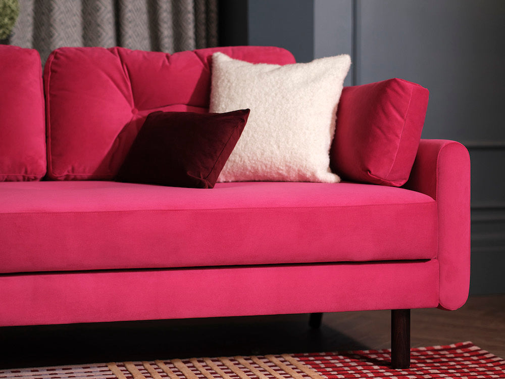
Add soft furnishings
Avoid using a collection of pink cushions on your sofa, and mix the textures, tones and sizes. Have fun with the soft furnishings, they will likely be the most inexpensive items in your home. Use pink, but also colours that compliment pink, like an off-white. And counterbalance with a nice texture.
If you want to add a crazy hot pink, inspired by Barbie-mania, then this is where you do it. Introducing hot pink to your colour scheme is easily done and inexpensive with soft furnishings. And can easily be changed. You can perfect the art of cushion arrangement by keeping it simple – for a three seater sofa add two cushions in one corner and a single cushion in the other.
Have fun, by mixing up the patterns, textures and tones.
Choose a paint
A colour that we’re now seeing everywhere, aside from Barbie-mania, is Dulux’s Colour of the Year 2024, Sweet Embrace. That’s the pink to go for when it comes to painting the majority of the walls. Sweet Embrace is so en-trend and beautifully captures the pink-vibe perfectly. It’s soft, subtle and can be paired with pastel, minimalist colour schemes.
If you want to use pink that is alot stronger, don’t paint your walls. Maybe paint your woodworks – skirtings, door frames, etc. The woodwork is easier to change, yet it still gives you that pop of colour. If you don’t have any woodworks, then you could paint the ceiling a bold-ish pink, if you have to.
Can you add pink to the kitchen?
Avoid using any strong pinks in the kitchen, sorry. Especially on the fitted pieces. If you insist on adding a strong pink to your kitchen, then introduce it through tiles (they’re replaceable). I say this because when there’s trends with strong pockets of colour, they tend to get old quickly – as we are seeing with Barbiecore. But, if you insist, avoid hot pink, use a Sweet Embrace tone on replaceable items like tiles.
Generally speaking, pink in the kitchen isn’t a colour I’d recommend.
Can you introduce pink to the bedrooms?
Bedrooms are classically somewhere that is a bit more relaxed and calm. So I’d suggest introducing muted down versions of pink, or a dirty pink. Again, Sweet Embrace would be perfect for the bedroom, it’s warm, subtle and evokes a sense of calm and tranquility. Steer clear of hot pinks and hot pink cushions, it just looks too tacky.
Again, mix the textures, and if you want funky, stronger colours, then stick with organic shaped patterns, a nice throw and rug. In short, add a pink or burgundy throw, or a patterned rug with a mixture of pinks and strong dye colours.
If you want to sleep, aim to avoid strong colors in the bedroom. You need the room to be relaxing.
Does pink go with architectural features?
In terms of architectural features. No, no, don’t do it. Again, as I said, strong pink is a trend that is dying out. If you insist on adding pops of strong pink to your home then do it on items and areas that can be easily changed. Not on architectural features.
Hot pink is a really fun colour, that is going to make a big statement in your room. It’s a strong trend that we’ve seen everywhere this summer. When we see a strong colour become a trend, we also see that trend fading out much quicker than subtler colours. But, if you insist on using hot pink, have fun with it. Again, introduce the colour with inexpensive products and ones that can be changed; cushions, tiles, throws, rugs - even wall art. Mix the textures and remember to 60, 30, 10 rule to help guide the tones and shades that you introduce to the room.
If you want to dress your home in pink, I’d strongly recommend using a tone that is lighter and more versatile. Sweet Embrace is the perfect colour to do this with – it can be mixed with a multitude of colours and helps evoke a calming, minimalist environment.


