
Pastel Colour Interiors: A Guide to 'Tropic Like Its Hot'
Pastel Colour Interiors: A Guide to 'Tropic Like Its Hot'
Introducing Pinterest’s ‘Tropic Like It’s Hot’, a trend infused by tropical accents and pastel colours. Soft, soothing, and endlessly versatile, pastels have the power to transform any space into a haven of tranquility and elegance. And this season, we're seeing a delightful fusion of pastel palettes with tropical touches, bringing the warmth and vibrancy of summer indoors.
Architectural Digest talked about this trend at the end of last year. The interiors publication explained that finally, the interiors and fashion world were on the same page, at the same time. Usually, fashion is one year ahead of interiors so it's exciting to see the industries alined for the first time. According to Architectural Digest, ice cream pastels are among the most covetable colours right now and we are here for it.
So, in this blog we’ll dive into the exciting fashionista trend by looking at the following:
- Key elements of the trend
- The psychology behind paster colours
- Colour ratio: How to mix pastel and tropical
- How to bring this trend into your home
What are the key elements of the pastel colour trend?
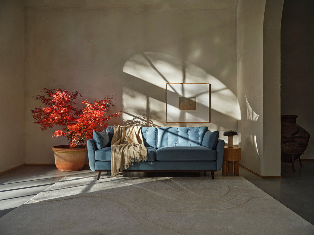
Pastel colours are characterised by their soft, muted tones that evoke a sense of tranquility and serenity. These hues, such as pale pink, baby blue, mint green, and lavender, create a calming atmosphere and serve as a versatile backdrop for various design styles.
One of the main strengths of pastel colours is their versatility. They can be incorporated into virtually any interior style, from minimalist and Scandinavian to bohemian and coastal. Pastels can be used as the main colour scheme, or as accents to add depth and interest to a space, which makes this trend easy to incorporate into an existing style. Additionally, pastels can be paired with bolder accent colors for added contrast and visual interest.
The tones are light and airy and can make a room feel more spacious and open. They reflect light well, making them especially well-suited for small rooms or spaces with limited natural light. Pastel colors pair beautifully with neutral tones such as white, beige, and grey. These combinations create a harmonious balance, allowing pastels to stand out without overwhelming the space.
Key elements of the pastel colour trend revolve around creating a soothing, versatile, and visually appealing environment that stands the test of time. Whether used sparingly as accents or as the main color scheme, pastel colors have the power to transform any space into a haven of tranquility and elegance.
Are pastel colours good for mental health?
Despite their softness, pastel colours can evoke different moods depending on how they are used. Soft pastels like blush pink and powder blue can create a romantic and feminine atmosphere, while cooler pastels like mint green and icy blue can lend a refreshing and invigorating feel to a space. We used to think that strong, bright colours boosted our moods but that's not always the case, for example, red can evoke feelings of panic and anger.
We now know that light pastels like peach, lilac, and mint greens enhance and uplift our moods. These colours can also be connected to nature – and, as we all know, nature has a positive impact on our mood and overall well-being. Other pastel colours like light blues and pink can elevate stress and anxiety.
What is the colour ratio and how do I mix pastel colours?
The colour ratio rule is what interior designers use to make sure their styling looks balanced, put together, and harmonious. I have spoken about this a few times in previous blogs and I'm always referring back to this for my designs.
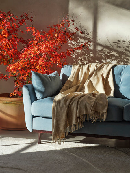
60% (main colour), this will be things like walls or flooring, whatever is the largest service area. 30% (secondary colour), this will be items such as curtains, sofas, or furniture. 10% (accent colour) finally this will be items like scatter cushions, accessories, or smaller furniture items like stool.
How do I bring the pastel colour trend into my home?
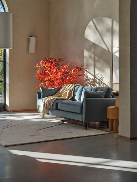
Beginning with the main colour, it's customary to opt for a lighter tone to establish a sense of balance and prevent the space from feeling too dark or overpowering. Consider hues like pale pink or light mint if you're fully embracing this trend. These gentle tones not only evoke a serene ambiance but also complement the tropical theme beautifully. However, if you're not ready to fully commit to pastels, sticking with a neutral color is a safe choice. As mentioned earlier, pastel shades harmonise effortlessly with neutral backdrops, ensuring a cohesive and visually pleasing interior.
The secondary colour. This is where you can introduce a slightly darker or stronger hue to add depth and interest to the space. If you've opted for neutral walls, consider bringing in a pastel colour for this secondary role. Conversely, if your walls boast pastel tones, feel free to incorporate neutrals for items like the sofa or curtains. However, if you choose this route, it's essential to balance it out by introducing a mix of secondary pastel colors and tropical accent tones through cushions or throws. This ensures a dynamic and cohesive look that celebrates the essence of the pastel and tropical trend.
Accent colors. These elements, such as scatter cushions, throws, table lamps, and accessories, add the finishing touches to your space. Here, you have the opportunity to infuse personality and flair by incorporating a mix of different hues. However, it's crucial to maintain balance and cohesion. Aim to work with around three different colours throughout the room to avoid a cluttered or chaotic appearance. This strategic approach ensures a harmonious and visually pleasing composition that elevates the overall aesthetic of your space.
If you're aiming to make a bold statement, consider incorporating various tones of the same pastel color, such as mint green, and combine it with tropical finishes like rattan, stones, linens, and other natural materials. Take inspiration from The Pieve Aldina, a stunning hotel in Tuscany, which beautifully showcases how different shades of the same pastel color can be paired together to create a cohesive and visually striking aesthetic. This approach adds depth and dimension to your space while maintaining a cohesive and harmonious look that exudes elegance and sophistication.
As we embrace the warmer months ahead, why not bring a little slice of paradise into your home with the enchanting combination of pastel colours and tropical touches? Whether you're revamping your living room, bedroom, or entire home, infusing your space with the soothing hues of pastels and the vibrant energy of the tropics is sure to create a retreat that you'll never want to leave.
So go ahead, let your imagination run wild, and transform your home into a summer sanctuary that captures the essence of laid-back luxury and tropical bliss.


