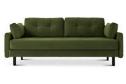
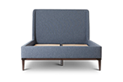
 Model 01
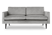
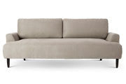
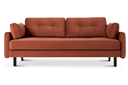
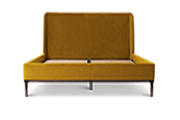
 Model 02
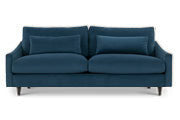
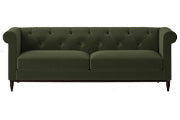
 Model 03
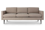
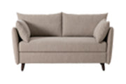
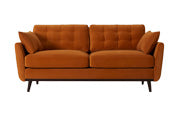
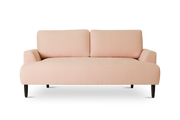
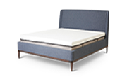
 Model 04
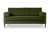
 Model 05
 Model 06
 Model 07
 Model 08
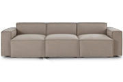
 Model 09
 Model 10
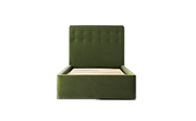
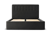
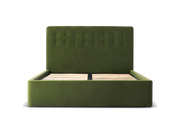 Bed 01
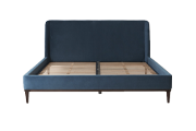
 Bed 02
 Single
 Double
 King
King
 Super King
 Mattresses
 All Beds

Every year, Pantone and Dulux each release their ‘Colour of the Year’; the outcome of separate conversations with design experts to understand the mood of the public and how colour in the home is influenced by this.
Pantone’s colour trends report for London Fashion Week reflects the sentiment used by the design experts and stylists in our interior design trends 2022 predictions article; the need for ‘grounding and simplicity’ in the wake or aftermath of the pandemic has never been greater. The ten standout colours also fuse our deep connection with nature, wellbeing and the need for comfort and familiarity.
Although Pantone’s spring/summer colour trends report is fashion related, it can also be used to influence our homes. The fashion and interior industries are very closely linked; what we see in one will soon translate into the other and vise-versa. The colours are a mix of neutral, pastel, playful and earthy tones, which encourage freedom and self-expression.

Executive Director of the Pantone Colour Institute, Leatrice Eiseman, says: “Our use of colour is connected to the cultural mood. As we explore a new future, we are looking for opportunities to do something completely different. Colours that celebrate our desire to break boundaries satisfy our fervent need for playful creativity and unconstrained visual expression as we enter into this new, uncertain time”
Pantone Colour of the Year 2022
Pantone’s Colour of the Year 2022 is PANTONE 17-3938 Very Peri.

PANTONE 17-3938 Very Peri represents colour trends from the digital world that are being reflected in the physical. Pantone goes on to explain how the rise in gaming, artistic community and the popularity of the ‘metaverse’ is reflected in the Colour of the Year 2022. All of which is a result of our physical and digital lives merging as we come out of big isolation.
Laurie Pressman, Vice President of the Pantone Color Institute says: “The Pantone Color of the Year reflects what is taking place in our global culture, expressing what people are looking for that colour can hope to answer.” She continues to add:“Creating a new colour for the first time in the history of our Pantone Color of the Year educational colour program reflects the global innovation and transformation taking place. As society continues to recognise colour as a critical form of communication, and a way to express and affect ideas and emotions and engage and connect, the complexity of this new red violet infused blue hue highlights the expansive possibilities that lay before us”.
PANTONE 17-3938 Very Peri is a strong, bold colour. The best way you can add this colour into your home is through transitional pieces. Introduce through scatter cushions, throws, pieces of artworks or prints, and think about painting one wall – maybe a chimney breast or door frame.
Dulux’s Colour of the Year 2022
Open skies and the feeling of needing a breath of fresh air, led Dulux to naming Blue Skies as its colour of the year.
The discussions which led to this decision was down to the role of the home and how this has changed over the last 18 months, the need to add nature into the home, and creating comfort and inspirational environments through the arts. Dulux says: “Bright SkiesTM is a light, airy and optimistic blue that’s good for the soul. It promises to open up and revitalise your home.”
Dulux have also suggested four interior or styles which compliment, and can be worked with, Blue Skies.
To create a multi-functioning living room, Blue Skies can be paired with vibrant, bright colours of similar tones. Dulux suggests using a mix of pinks and yellows to keep the room light and airy, but also playful. 
Image: Dulux
Colours: Bright Skies™, Healing Spice, Rose Canopy, Golden Cookie
To bring the outside in, Dulux has a range of tonal greens and blues to keep the living area positive and to help take advantage of nature’s natural positive effects on wellness. Light, fresh colours will help connect with nature; this can also be done by introducing a mix of plants to the interior. 
Image: Dulux
Colours: Moon Cloud, Bright Skies™, River Valley, Denim Drift™
Another colour scheme would be to introduce neutral colours that are soothing, and encourage a relaxing environment to recharge and inspire creativity. Dulux’s soft and airy colour palette is perfect to help close off from the outside, creating a completely zen-like interior. 
Image: Dulux
Colours: Bright Skies™, Restful Slumber, Birch Root
Lastly, Dulux’s last colour palette is for those looking to create a comfortable home, but also an open space for all eventualities. A combination of light whites and neutral colours promotes a clean palette ready for anything daily life throws at you.

Image: Dulux
Colours: Bright Skies™, Rubble Road, Cliff Walk
Dulux and Pantone have both chosen colours which reflect the general mood and sentiment felt by the public; a result of the last 18 months and how the pandemic has affected every part of our daily lives. The home has become a place of sanctuary, personal expression and freedom.
We will update this blog as soon as Pantone releases its colour of the year 2022, but until read our interior design trends 2022 – predictions article.


Want more? Discover interior inspiration and exclusive updates
Sign up to our weekly newsletter for more like this.